Saturday, 4 February 2012
Friday, 3 February 2012
What have you learned from audience feedback?
There was a four second white screen during the video. This was a fault of updating the video to ‘YouTube’. All what was mentioned was that the last voiceover audition was chosen for our final clip.


Magazine- The original magazine was criticised harshly. It had parts of the conventions missing, such as no barcode or dateline. The audience picked up on this and help us realise how précised we have to be with the creations for them to pass as industry standards.
They hated the colour scheme saying that it was to random. This led us to research into realistic already used colour schemes from existing soap opera magazines.
The cover lines were too small and hard to read for customers. We enlarged all cover lines as a result.
The 45p tag looks tacky. It destroys the look of the magazine. So we acted upon this and tidied it up helping keep the impression/mood of the cover.
The audience did like the cutting out of all the characters. Saying they looked brilliant. They also liked how easy the title was to read. They say the storylines presented through the cover lines were good and fitted with soap operas. Finally, the left third looked good and would play a crucial part in advertisement.
Poster- The original poster was criticised equally as harshly. It had one convention missing. The poster had no slogan. Slogans are important to make the soap seem witty and appealing. They usually also suggest to the audience what type of soap the poster advertised or possible plots.
The title was hard to read and the audience asked for a clearer version.
The channel four logo brakes copy right rules so we decided to create our own channel logo.
Some of the characters are out of the frame. This focused our attention on making the poster looks neat and tidy.
The soap doesn’t seem very rural. This was a planned however. We want to make the rural soap seem fresh and young which is brought around with the arrival of Rachel Manning’s. This idea is better shown in future drafts.
Could you add a soap logo? As a group we decided not to add a soap logo as it seemed out of place for the mood we were creating. This dismissal breaks no conventions of soap opera posters.
The audience did like the details shown through each character, their facial expressions and body expression suggest what type of characters they were and the audience noted this. They also looked the use of decorative, for example, the frame holding the poster together.
Magazine- The original magazine was criticised harshly. It had parts of the conventions missing, such as no barcode or dateline. The audience picked up on this and help us realise how précised we have to be with the creations for them to pass as industry standards.


Magazine- The original magazine was criticised harshly. It had parts of the conventions missing, such as no barcode or dateline. The audience picked up on this and help us realise how précised we have to be with the creations for them to pass as industry standards.
They hated the colour scheme saying that it was to random. This led us to research into realistic already used colour schemes from existing soap opera magazines.
The cover lines were too small and hard to read for customers. We enlarged all cover lines as a result.
The 45p tag looks tacky. It destroys the look of the magazine. So we acted upon this and tidied it up helping keep the impression/mood of the cover.
The audience did like the cutting out of all the characters. Saying they looked brilliant. They also liked how easy the title was to read. They say the storylines presented through the cover lines were good and fitted with soap operas. Finally, the left third looked good and would play a crucial part in advertisement.
Poster- The original poster was criticised equally as harshly. It had one convention missing. The poster had no slogan. Slogans are important to make the soap seem witty and appealing. They usually also suggest to the audience what type of soap the poster advertised or possible plots.
The title was hard to read and the audience asked for a clearer version.
The channel four logo brakes copy right rules so we decided to create our own channel logo.
Some of the characters are out of the frame. This focused our attention on making the poster looks neat and tidy.
The soap doesn’t seem very rural. This was a planned however. We want to make the rural soap seem fresh and young which is brought around with the arrival of Rachel Manning’s. This idea is better shown in future drafts.
Could you add a soap logo? As a group we decided not to add a soap logo as it seemed out of place for the mood we were creating. This dismissal breaks no conventions of soap opera posters.
The audience did like the details shown through each character, their facial expressions and body expression suggest what type of characters they were and the audience noted this. They also looked the use of decorative, for example, the frame holding the poster together.

Poster- This second draft was more of an experiment. We wanted to see if fewer characters looked better. This would be ideal because it would be easier to arrange the layout of the poster because there would be an empty room. Audience feedback taught us that the poster looked bare and boring. So we acknowledge that we needed to add all the characters into the poster both so the audience can be introduced to them and also to look aesthetically pleasing.

Magazine- This is the second draft for our poster. The audience preferred the larger font and it was truer to conventions because the page was busy and packed with images.
None the less, the colour scheme was awful and was moving further away from conventions. We address these problems with our final draft.

Poster- The above image is our final poster. We have adopted the audience feedback and have applied the suggestions to our piece.
Firstly, we kept the poster busy. The audience didn’t like the spaced out second draft and I agree. So we have all the character in a line. By having them spread across the frame it appears busy.
Secondly, we kept the background white. By keeping the background white we didn’t have to deal with the issue of characters being out of proportion with the background.
The audience seemed confused about the message of our poster and the imagery that goes along side it. The title ‘Out with the old in with the Essex’ didn’t match the image of the second draft. Rachel Mannings was not the centre of attention as she was positioned to a side of the frame. To help her stand out we added an effect to the background characters called ‘Sepia’ which made the other characters look old fashioned. We wanted to connote Rachel was bringing a new grove to ‘Mill Lane’ so we positioned her in the front of the poster in the photos original colour. This made it clear to the audience what the main introductory story of ‘Mill Lane’ was and begun the narrative of our soap plot.
The font of the ‘Essex’ also helped connote the idea that Rachel is bringing a new mood to the residence of ‘Mill Lane’. The ‘Mill Lane’ title kept the old fashioned colouring you would expect on a frame plaque. This helped juxtaposition the slogan and showed to all potential audiences that the show isn’t just for the younger generations.


We used audience feedback to see how satisfied our audience was with our final drafts. The black lines are where I crossed out un-helpful messages. These messages were usually from audience members knowing one of the actors and became excitable, commenting in a friendly rather than a productive manner. This is just the first page of feedback. It is impossible to include all the feedback as it is being updated continuously.
The first comment was written by ‘Meg Walsh’, ‘Charley looks badass!’. Firstly, Charley is the actress for ‘Rachel Mannings’, Rachel is the girl in the centre of the frame in colour. The reason her looking ‘badass’ is fantastic is that we want her to seem rebellious, destroying ‘Mill Lanes’ peaceful community.

‘Lee Dyer’ didn’t like the plain background. However, others preferred it and it was easier to create a poster with a black background. This is an example of how you can’t cater for everyone but instead adjust your work to cater for the majority of the audience.
The most reinsuring post was noted by ‘Chris Guyart’. He said ‘The story line your advertising is really clear. It’s obvious Charley comes from Essex and is ruing the piece in Mill Lane.’ This proved that the connotations we wanted to express was noted, spotted and obvious.

Magazine- Our final magazine also incorporated all audience feedback and it is noticeable. Mainly, to address all suggestions and issues we followed conventions or magazine listing covers. This included the colour scheme, title, font and all aspects such as barcodes, dates and price tag.


We used audience feedback to see how satisfied our audience was with our final drafts. The black lines are where I crossed out un-helpful messages. These messages were usually from audience members knowing one of the actors and became excitable, commenting in a friendly rather than a productive manner. This is just the first page of feedback. It is impossible to include all the feedback as it is being updated continuously.
‘Molly Adkins’ said ‘I actually thought that was a real magazine.’.
‘Jack Ogles’ said ‘That is amazing! It looks so real’.
‘Matt Bonner’, loves how the pictures overlap and how the colours fit together. ‘It looks very slick!’.
‘Cath O’brian’ says ‘That looks amazing! Like a real magazine!’
All the above comments prove that following the conventions of a magazines cover has made our magazine much more appealing to all audiences.
Who did we interview?
After we completed our trailer we had to interview a wide range of people to get an accurate indication of opinions regarding our trailer. The main seven representations of media are gender, age, sexuality, disability, ethnicity, nationality and social class. So we targeted audience to give feedback who could cover all these areas of representation.
Representation feedback | Participant/s | Occupation | Feedback |
Gender | A wide range of Males and Females. | A wide range of all demographic grouping jobs. | Both genders noticed that Rachel Manning’s was the eye candy of the soap and was represented as a ‘diva’. She holds the power over the other members from the cast which is connoted when Ryan Parker ignores his potential partner to stare at Rachel. |
Age | Mainly focusing on interviewing young adults and teenagers but I also used two elderly citizens who are retired. | A wide range of demographic grouping jobs. | It was the younger audiences’ who found the soap opera more appealing. Elderly audiences could unpick all encoded information and decode as the producer intended but found the soap to be ‘too active’ for them to enjoy (not appealing to older audiences due to the lack of peacefulness which could be thought of as realistic verisimilitude). |
Sexuality | Unnamed. | I asked three homosexual males with a variety of age and jobs to tell me their opinions of our soap opera trailers representation of Marcus Brooker (Marcus is a homosexual). I asked no homosexual females because I do not know any. | All boys found the representation to be unrealistic. Marcus is seen reading a makeup magazine and all boys found this to be stereotypical of television. They did however agree that Marcus Brooker storyline with his father, Barry Brooker, was realistic to life and conveyed half of a correct representation. |
Disability | Tanya Borrow | Tanya is my Auntie who suffers from marfan’s syndrome and other mental handicaps. She enjoys watching soap operas and watches all of the mainstream ones show on television. | Tanya cannot be articulate with her words so her feedback was hard to unravel. From the conversation I had with her I could tell that she acknowledge that Rachel Manning’s was disturbing Mill Lane. All other enigma coded information was dismissed by Tanya but she enjoyed the work. |
Ethnicity/Nationality | A selection of ethnic males and females. | A wide range of demographic grouping jobs. | Our only ethnic actress in our small cast plays the character Jennifer Ward. Her storyline portrays a negative stereotype, Jennifer cheats on her husband. However, the feedback from audiences’ revealed that no interviewees were offended. Instead, felt that it was okay to categorize a character as negative because if we did not we would be highlighting fears offending, making Jennifer seem perfect, which is racist in itself. Jennifer later gets seen as a protagonist so the stereotype levels out to convey a fair representation. |
Social class | All candidates | A variety varying from librarians, business men, mechanics, unemployed, cleaners and many more covering all demographic groupings excluding demographic grouping A. | Our soap doesn’t show a huge range of social class. In a rural area the majority of citizens are of the working class having similar, agricultural jobs. So this representation is fair and conveys accurate verisimilitude. Audiences didn’t find this small demographic grouping as negative and weren’t put of watching the soap even if characters didn’t have classes’ representative of them. |
Thursday, 2 February 2012
How effective is the combination of your main product and ancillary texts?
The purpose of the above clip was to inform you, the reader, of all the similarities between all three types of advertisement. Each presents the same storylines and furthers your understanding of each through several separate methods. For example, Rachel Mannings plot is shown in three separate stages. Firstly, the magazine shows that she has begun a love triangle and that she is ‘trouble’. Secondly, the poster informs us that Rachel is not a normal resident of the rural ‘Mill Lane’, but instead urban ‘Essex’. Lastly, the trailer shows she is not liked but any of the residence habiting ‘Mill Lane’ and that she is fracturing a relatively peaceful society. All three brought together informs the viewer about Rachel position in the soap opera and it is this three way partnerships that links all advertisement products.
Each piece of advertisement conveys the same message of the location for ‘Mill Lane’; a rural, old fashioned village. Once again, similar to the advertisement of stories, we used each form of advertisement to convey a new element to the overall message. The poster has no background but shows all characters in an old, fashioned brown which resembles that of early photographs. This connotes the location of ‘Mill Lane’ is old. The ‘Mill Lane’ font is also old fashioned compared to the above slogan which furthers the connotation that ‘Mill Lane’ is old fashioned. The magazine shows the background behind the images and shows some characters dressed rurally. This matches the trailers enigma coded information and combining the three the audience figures out the location is an old, rural village.
Lastly, apart from the magazine which I explained in the above video, all products advertise the element which allows the viewer to watch the soap opera including time, date and channel.
Lastly, apart from the magazine which I explained in the above video, all products advertise the element which allows the viewer to watch the soap opera including time, date and channel.
Wednesday, 1 February 2012
In what ways does your media product use, develop or challenge forms and conventions of real media products?
Soap Opera Trailer

The above page shows just a small fraction of similar conventions of our trailer. The reason our trailer follows conventions is because we are advertising a story to premier the show. By advertising and presenting ‘Rachel Manning’s’ we have to follow already existing examples of soap opera trailers as they also introduce characters.
The location of our soap is also convention, many soap operas, such as ‘Emmerdale’ are set in rural locations. Yet, we broke the convention of the audience we’re targeting. Most rural soaps advertise a more mature audience but through younger characters we are targeting a broader range of younger and elderly males and females. This gives us a stronger chance of having a successful soap opera.
Most soap opera trailers are also set in a time period. Our soap trailer breaks this convention, as it shows an entire day and has no set period. This was done so the audience could get a rough idea what a day (or an episode) in ‘Mill Lane’ would be like.
Our trailer follows trailer convention regarding editing. We used fade to blacks which separate the scenes/clips from the soap. This is an effective way to introduce each character within their own scenes.
Finally, to help pursued this younger audience to watch our soap we had a young, upbeat high tempo instrument background music which connotes this isn’t the ordinary rural soap opera. This, in turn, broke the conventions of a soap opera trailer as many of them will use lyrics to imply and suggest a narrative. We choose not to have lyrics as we wanted the storylines to be visually delivered.
Soap Opera Magazine

Soap Opera Trailer

Tuesday, 31 January 2012
Media facts about Mill Lane.
I and my group have the best understanding about media theories which apply to Mill Lane. In this post I am going to speak about a selection of such theories.
‘Neale’, key leading media theorist says “Genre is a set of expectations.” By selecting the soap opera genre we must deliver expectations for the audience which is associated to this genre. But before we could deliver these expectations we had to recognise/perceive this genre to our audience. We did this through paradigms and conventions of the soap opera genre. Iconography was also used constantly throughout, such as the location of the pub. We allocated themes in our trailer which is recognised to the soap opera genre such as affairs, homosexuality and love triangles. The convention of soap opera genres is to leave the narrative open at the end of each episode (of our case the trailer). We also told multiple stories through our narrative which is part of the soap opera genre; this is known as an episodic narrative. On our group blog we showed how we applied narrative theories presented by’ Propp’ and ‘Todorov’ to our trailer. Despite our narrative being fractured during the trailer (as it skips time) it is presented in a linear pattern, which is connoted by the natural lighting change of morning to evening.
In my post called ‘What type of audience is a soap opera audience?’ I have recognised what type of audiences watch soap operas. Our trailer uses the Hypodermic Needle theory as our audience only watch soap operas for passive Uses of Gratification purposes. This allows for the audience to decoded messages preferably that we, as producers, encoded; such as the personality of Rachel Manning’s. The post listed above goes into depth about each of these theories.
We encoded these messages using semiotics, known as the study of signs. ‘Peirce’ (1931) said “We think only in signs.” “Nothing is a sign unless it is interpreted as a sign.” By this ‘Peirce’ recognises that denotations/signifiers have no meaning until audiences decode connotations encoded by producers. You could turn this theory into an equation... Signifier + Signified = Sign. The magazine Marcus Brooker reads held no information until you add a connotation to it. The magazine (the signifier) becomes a sign that Marcus is a homosexual when the audience expected this through the magazines content and Marcus’ father’s behaviour towards his son.
Hegemony is the theory that the majority have power over the minority. This theory did not apply to Mill Lanes trailer. Rachel Mannings (the minority) held power over the majority which was signified by all disturbances happening when Rachel was nearby; thus, turning this theory upside down.
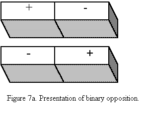
We used binary opposites in our trailer as well. ‘Strauss’ believes that any effective piece of story will have binary opposites. Rachel Mannings is perceived as cruel, manipulative and came from an urban life style. Harriet Collins is Rachel’s binary opposite as she is represented as kind, caring and comes from a rural life style. Using this our audience can see the beginning of a rivalry between two powerful female characters.
We used ‘Laura Mulvey’ Male Gaze theory in our trailer to attract a greater male audience. Rachel Mannings has a pan shot from her feet to her head. This is eye candy for male audiences and gives them further reasons to watch our soap opera. The Male Gaze theory is conventionally found in nearly all forms of media, from page3 girls in newspapers to films such as 'Transformers'.

‘Jakobson’ says “There are ideologies behind every media representation’. These ideologies are stereotypes of characters, such as Rachel being from Essex means she dresses inappropriately and has poor education skills. This is a negative stereotype of our character Rachel Mannings, we wanted to make the audience dislike Rachel and to do so we followed a negative stereotype.
‘Tessa Perkins’ acknowledges that some stereotypes and not harmful, in turn are positive. However, we used no positive stereotype for any our characters, therefore representing them unfairly. However, we did this as soap opera audiences don’t want a realistic life or a show which conveys total verisimilitude. Instead they want locations to convey verisimilitude and have a cast which is out of reality, making them entertaining, hence feeding the desires for our passive audience.
Monday, 30 January 2012
Magazine Final Draft

This is our final draft for our magazine. Audience feedback from early drafts suggested the magazine did not look professional enough. So, to resolve this issue we followed all British successful conventions. Comparing our magazine to existing ones you can see that it's to a very high standard and looks remarkably similar.


We created the magazine using ‘GIMP’, 'GNU Image Manipulation Program'. ‘GIMP’ allowed us to cut out the images brilliantly. It was time consuming, yet, for a great end result it is worth it. As a result, we have a great selection of main and sub images. Each introducing both the characters and the plot which goes alongside them. For instance, the cover line ‘I know who the father is!’ has the Mother and the two potential candidates for the Father standing behind her. This connotes to the audience that the characters of this plot are the three shown and the positioning of the characters, having the Mother in the middle, furthers this enigma coded information.


A convention of soap opera magazines is the use of hyperbolic wording. Words which are both eye catching and dramatic. Like the picture below.
We have a selection of hyperbolic words presented both through colour, colour backgrounds which allow them to stand out and finally capital lettering. On the below image I have circled all the hyperbolic words which will grab potential readers attentions.

Through using both the images and hyperbolic wording we have made each individual cover line on the magazine both interesting and attention grabbing. To allow the audience to better understand each story and for the character's we have put, in most cases, a relevant background to each picture. For example, ‘Edith’, the mature woman is seen in her Kitchen and the ‘Vicar’ is seen in front of the Church.
We have included the needed elements to define a magazine. Which are as follows, a barcode, a dateline, a title, the issue number and the price. All these elements makes the cover look professional.
We could have included the ‘DECS’ logo; which is the channel the soap will be aired on. This is a brand new soap and will need lots of advertisement. I believe it is a must have, yet, some members of the group believe it can be left inside the magazine. My argument is, if a potential reader doesn’t by the magazine they will at least know from the title what channel the soap is on and therefore becomes a potential viewer.
I also believe the timing of the soap also must be included on the cover yet we are in a similar discussion.
To date we are in debate regarding the inclusion of the channel, its logo and the timing of the show including days on air. If we do decide to change we will do so immediately.
Monday, 23 January 2012
Poster Final Draft and Development

This is our final poster. We hope to achieve three targets with this product…
· Advertise our soap opera.
· Encode a message which was successfully decoded by the audience.
· Looks aesthetically pleasing, meeting levels of industry standard.
Advertising our soap opera.
To advertise our soap opera successfully we followed conventions of advertisement posters which have been used in the past to successfully advertise products. We included days, timings, channel and the soaps name. By including the following we give our potential audience full opportunities to watch our soap opera.
Encode a message which was successfully decoded by the audience.
We had to connote messages to the audience about characters, locations and storylines. These messages then can be decoded by the audience and hopefully have a preferred reading from the audience who understands the messages presented. Stuart Hall, media theorist, says there are three ways the audience will decode a message…
· A preferred reading as the producer intended.
· A negotiated reading, so some parts of the producer’s intention were accepted.
· A resistant reading, where the audience disagrees with the producer’s intention and find meaning or a different kind behind the decoding.
How did we encode messages to the audience regarding characters and plots? And how did they decode these messages? We needed the audience to acknowledge the main plot of the soap opera launch was the arrival of Rachel. Equilibrium was in motion within Mill Lane until this character disturbed the piece (the beginning of Todorov’s theory). We encoded this character and her plot through colours, framing and wording. By having only Rachel in colour within the centre of the poster the audience can determine that Rachel is the character which the title is referring to. The title explains the plot and gives the audience a rough understanding of Rachel history, thus, establishing her and her plot. This was recognised by the audience and was a reading preferred by our production team. Other characters stand beside their piers within storylines which could be decoded by the audience, but equally, may be a negotiated reading of the media text. Outfits may suggest links to the characters but by advertising the main story within the poster the potential market can establish a rough idea of the plot behind Mill Lane.
How did we encode messages of the location to the audience and how did they decode these messages? By having the characters beside Rachel in the back in a brown (associated with old) colour scheme you can determine these people live a stereotypical old style life. The slogan informs the audience that Rachel is bringing Essex to Mill Lane. So we know these residences are from Mill Lane. The colour scheme of the residence therefore connotes Mill Lane is an old fashioned, stereotypical rural village that live of the land through farming (connoted by Charlie Collins farming outfit to the far right of the frame) and other outdoor vacancies. This message was decoded successfully by the market and therefore was a preferred reading.
Tuesday, 17 January 2012
Rough Cut 2
This is our second rough cut. It has the missing shots but lacks minor tweaks. These tweaks include…
*Adding a voice over.
*Making our music seems less childish.
*Adding the channel logo and soap opera logo.
*Adding sound effects, for example, when the car goes past.
We have booked several hours onto the mac to complete the above list. Once done so I will inform how we overcame all these issues.
Monday, 16 January 2012
Poster, second draft
To help address previous criticisms of poster draft one we re-took all photos with a HD camera and switched to the program 'GIMP' (previously mentioned) so we could cut and edit images with ease.
Firstly, I got a good plaque and frame to establish the setting of our poster. Shown below.

We then took a good group photo of all the actors avalible for the poster photo shoot during the week. Shown below. We left gaps so to highlight where our other characters will be positioned for the final cut.

Then I began to edit and cut out the characters on 'GIMP'. Shown below. The Vicar character is highlighted, this shows the cutting out process. You craft around the character until you have made a perimeter around his outline. Then you cut.

I then began placing the character into the poster frame. I did not change their original size until all characters were placed, this was so I could keep the correct proportions in height and width. Shown below.

Once the characters were positioned I began to change the size so they all fitted within the frame but still remained in proportion. Shown below.

Finally, I added all missing convention of a soap including dates, channel logos, slogans and titles. Shown below.

Despite all the modifications to try and improve the poster there are still two huge errors. Firstly, we are missing four characters. This is because the actors were not available for the photo shot and we are planning a date to take the pictures before the end of the January week beginning with the 16th. Secondly, despite using ‘GIMP’ the cut out of each character still is under industry standard. I think if I practice cutting out images I will become better using the program and then can meet the standard required to make a successful advertisement poster.
Tuesday, 10 January 2012
Channel logo design

Feedback suggested that we needed to make our own channel logo. This was a group intention before we showed audiences’ our trailer rough cut so we already have created several designs as possible channel logos. The below are the designs I created.


The inspiration from the two above logos came from a wide selection of American television channel logos using stars, including the ‘BET’ logo showed above. The connotation of our logo above is that the channel is fresh and new; appealing to new, younger audience generations. This is done through the logo star; the big font and the colour scheme of black and grey which is seen as young and hip. This, however, is not good marketing for our soap. Our soap must appeal to all audiences and therefore be featured on a channel which programs shows for a wide range of demographic groups and ages. Therefore, we need a more grown up, appealing logo for all types of people.

This one was inspired from the American ‘CMTV’ logo shown above. The logo was aimed to look friendlier, so not to make the mistake of appealing to a younger more aggressive audience like the above logos with the star. The colours are all friendly and create a calm atmosphere. However, the logo, I feel, is to friendly and looks like a child’s channel logo. ‘CMTV’ is a child’s channel so this must be the reason why their logo is how it is, to appeal to the very young generation. Realising this I scrapped the above logo idea and brought my research closer to home looking at British soap television logos.


The two above was inspired by the ‘channel4’ logo. I really like the look of this. The green connotes a more relaxed channel but the red connotes a more action packed, manly channel. So for the purpose of our audience we are targeting we would use the green example. However, despite really liking the design it is too similar to the ‘channel4’ logo (shown above) and is far from being original. The American inspired logos are okay, as it would never be recognised as a copy on British television. Yet, using a British channel logo and copying its main theme would make both the ‘DECS; channel look bad and could be followed up by a copyright issue.

This last logo was inspired from the ‘ITV HD’ logo above. The red connotes action which makes the channel seem intense. The black connotes a relaxed, fresher atmosphere for younger generations. Yet, again, this logo does not appeal to the older generations and therefore isn’t good enough for our group blog. This debate on logo has been continued on the group blog under the channel logo post.
Friday, 6 January 2012
Rough Cut 1
This is our original rough cut. It has several noticeable errors. Our biggest concern is the soundtrack and the continuity regarding mise-en-scene. The soundtrack is annoying, as it is extremely repetitive. It starts before the visual indicated moment; when Rachel hits the stereo, which makes the piece seem rushed. The continuity of the piece is no better. The work changes from natural high key lighting to low key in random positions. Disengaging the audience and destroying the atmosphere. However, I have noted both these errors in previous posts and the new song and re-filming we have done will correct our errors. On top of the major issues we have simpler ones to correct including a creation of a logo and a better speaker for advertising the show at the end of the trailer.
We also have several shots missing from our work. These shots have not been placed into the cut as to date but are being prepared to in short time.
Wednesday, 4 January 2012
Creating potential music
Screen shots of 'Audacity 1.3' and my song.

Using ‘Audacity 1.3’, a music creating and modifying program I have edited a selection of royalty free songs which I have downloaded from a wide selection of sites, including 'istock studio'. I combined these songs using DJing equipment I own. We will be testing the song with our trailer too see if it fits and establishes and atmosphere we intend. I, think the song is too upbeat, young, and fresh to be recognised by older audiences as a Soap opera they would enjoy watching. None the less, it is worth testing just in case it is sufficient. The song created is below. Footage for the video came from the 'windows live movie maker' package.
Image of main DJing equipment used.
Subscribe to:
Comments (Atom)