
Feedback suggested that we needed to make our own channel logo. This was a group intention before we showed audiences’ our trailer rough cut so we already have created several designs as possible channel logos. The below are the designs I created.


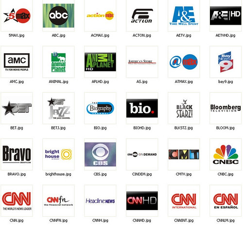
The inspiration from the two above logos came from a wide selection of American television channel logos using stars, including the ‘BET’ logo showed above. The connotation of our logo above is that the channel is fresh and new; appealing to new, younger audience generations. This is done through the logo star; the big font and the colour scheme of black and grey which is seen as young and hip. This, however, is not good marketing for our soap. Our soap must appeal to all audiences and therefore be featured on a channel which programs shows for a wide range of demographic groups and ages. Therefore, we need a more grown up, appealing logo for all types of people.

This one was inspired from the American ‘CMTV’ logo shown above. The logo was aimed to look friendlier, so not to make the mistake of appealing to a younger more aggressive audience like the above logos with the star. The colours are all friendly and create a calm atmosphere. However, the logo, I feel, is to friendly and looks like a child’s channel logo. ‘CMTV’ is a child’s channel so this must be the reason why their logo is how it is, to appeal to the very young generation. Realising this I scrapped the above logo idea and brought my research closer to home looking at British soap television logos.


The two above was inspired by the ‘channel4’ logo. I really like the look of this. The green connotes a more relaxed channel but the red connotes a more action packed, manly channel. So for the purpose of our audience we are targeting we would use the green example. However, despite really liking the design it is too similar to the ‘channel4’ logo (shown above) and is far from being original. The American inspired logos are okay, as it would never be recognised as a copy on British television. Yet, using a British channel logo and copying its main theme would make both the ‘DECS; channel look bad and could be followed up by a copyright issue.

This last logo was inspired from the ‘ITV HD’ logo above. The red connotes action which makes the channel seem intense. The black connotes a relaxed, fresher atmosphere for younger generations. Yet, again, this logo does not appeal to the older generations and therefore isn’t good enough for our group blog. This debate on logo has been continued on the group blog under the channel logo post.
No comments:
Post a Comment