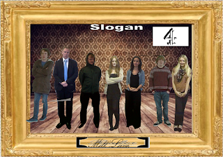
1) This is the first draft of our poster and it has obvious issues. Firstly, the majority of the characters do not look good. By this I mean they are either stood awkwardly or have had a bad photo taken of them. The characters Harriet Collins and Rachel Mannings look good, but the rest need improvement. We will improve the images by directing the actors better.
2) The cutting out of the characters isn’t to an industry standard. This was not a major priority for the rough draft, for we were mainly focusing on layout. Now however, it is a priority and must be treated as a massive focus in order to attract audience to what should be thought of as a professional, real show being advertised. This quality of cutting will be easier when firstly we use a high definition camera and secondly we take photos in front of a white background. We are also debating using the program called ‘GIMP’, GNU Image Manipulation Program, which furthers the crafting material to edit photography.
3) The background, I feel is good. But researching other possibilities will confirm if I am correct or not.
4) The plaque with the soap title, ‘Mill lane’, is a good idea which will be kept. None the less, we have to find a better font for the title which is easier to read.
5) Finally, we must plan a channel and a slogan for the piece. This is still being thought of and, similar to criticism ‘2’, wasn’t a major priority of the first draft.

No comments:
Post a Comment